Design Rescue
Improve your designs, even if you aren’t a pro! 🙂
1. Quality Images
Your images will catch the viewer’s eye first, and if they are of low quality, you have already made a wrong first impression.

Stock photos
These photos do not need to be as generic as people think, and they are a better option if you can’t provide your own high-quality image.
Image Size
You will have image size variation within a marketing piece but think of ways to be consistent. One way is to plan-ahead and designate one size for your body images if you have more than one. This will help streamline your look and give you less chance to make the mistake you see below!


Pro Tip
2. Contrast
There should be enough contrast between your elements so that your users can easily see it. This concept applies to text and images against backgrounds, as well contrast between text sizes, types and weight.

Amelia Edwards
Engineer

Indu Chakarvarti
Engineer

Magnus Kekhuis
Engineer
3. Add More White Space
It is typically easier to read text that has a higher line-height. Plus, it’s trendy to have a clean look and adding white space in any capacity helps achieve this. You can even add white space in between your letters!
White space does not have to be white! It just means the space between your elements. This can be anything from the space in-between images to the space in between your text.
WOODCHUCK ARTS
WOODCHUCK ARTS
4. Font Guide
CHOOSE TWO FONTS, ONE FOR YOUR HEADER AND ONE FOR YOUR BODY FONT.
HAVE FUN PICKING A TITLE FONT – BUT MAKE SURE ITS READABLE!
Pro Tip
TITLE FONTS
When you pick a title font, make sure it represents your company and that it’s readable! If you stick with Google fonts, you should be safe. Here a few samples that we like!


BODY FONTS
Body fonts don’t need to be fancy. Save yourself stress and just pick one of these body fonts we have vetted for you!
Baskerville
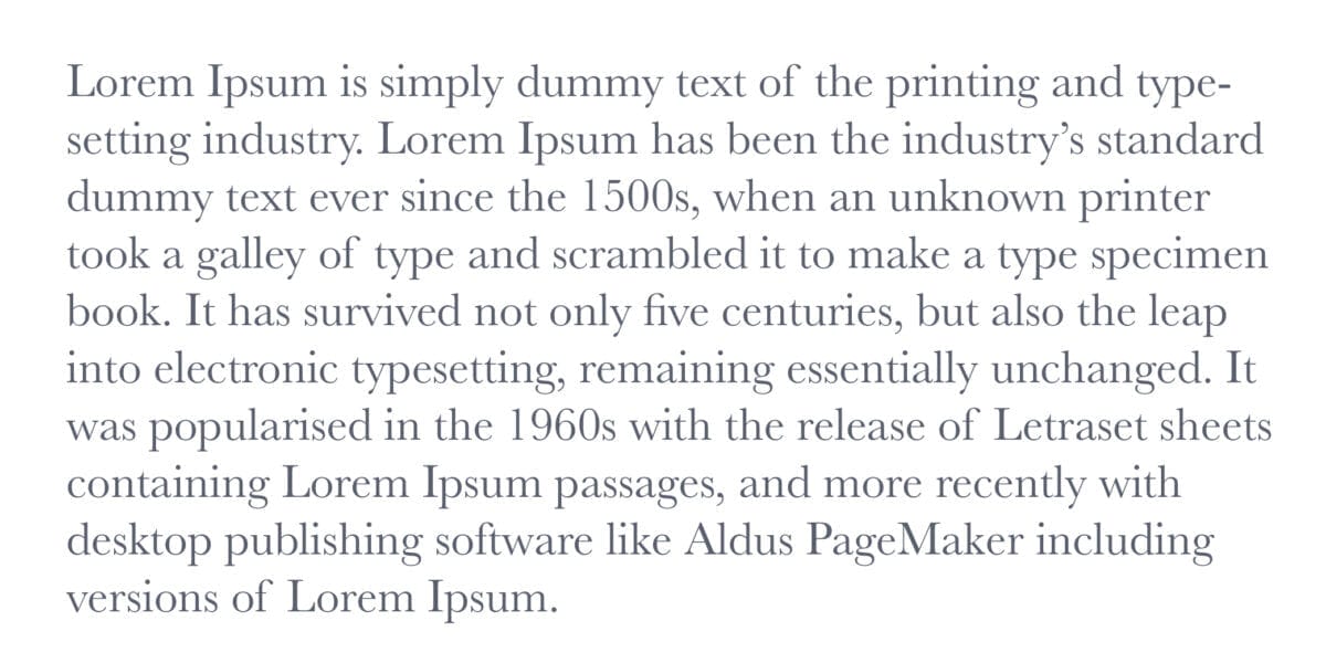
Josefin Sans
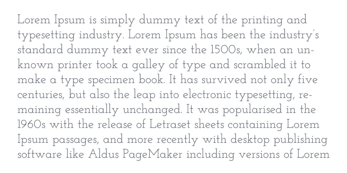
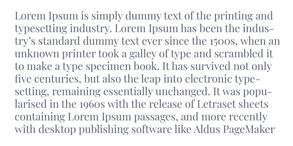
Playfair Display
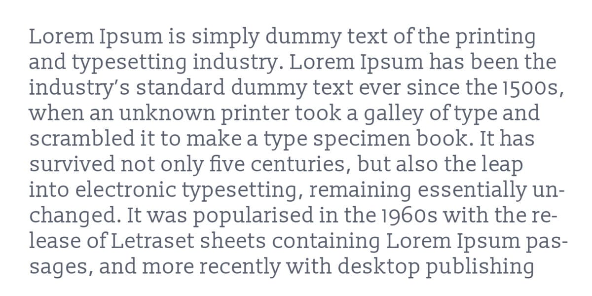
Slabo
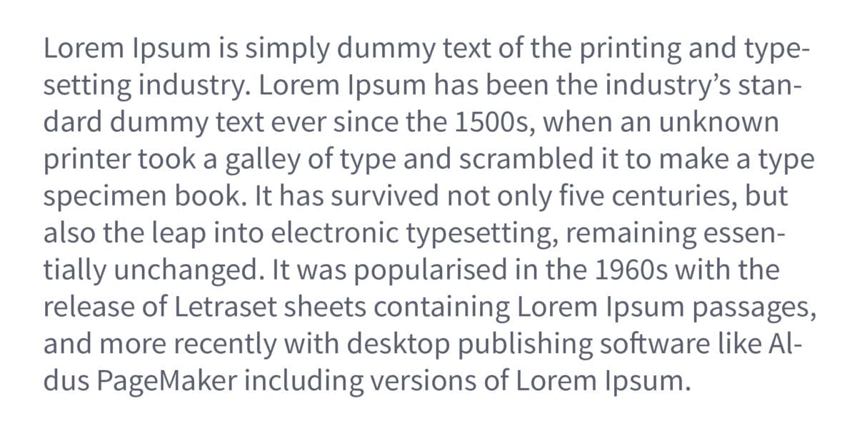
Source Sans Pro
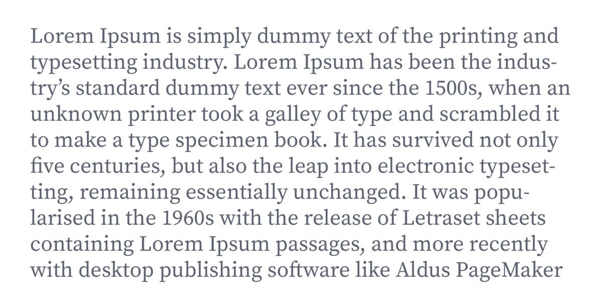
Source Serif Pro
5. Colors
Keep your colors consistent by picking and sticking to a color palate. If design is not your passion, don’t try and pick your colors yourself, use a color generator. They create beautiful palates that are on–trend and they provide color codes so that you can ensure your colors are the same throughout all your marketing materials.
https://coolors.co
https://colorhunt.co
https://colorpalettes.net
6. Consistency
CHOOSE YOUR FONT SIZES
Defining these five font sizes should give you plenty of choices to use across your various marketing materials. Choose what makes sense for your business; these are the sizes we use! We have found that these sizes work great on both mobile and print.
Header 1 80px
Header 2 60px
Header 3 48px
Header 4 36px
Header 5 24PX
Paragraph 16px
Pro Tip
CHOOSE YOUR FONT COLORS
Stick to your color palette and your documents and website will look great, but sometimes it helps to assign specific colors to your font sizes. At the very least, choose a neutral color for your body text and ensure that it’s all the same throughout any materials.
IMAGE TREATMENT
Decide how you want your images to appear! Do you want them to have a border, drop-shadow, always be square? There is no right or wrong answer – just keep your image treatment consistent. If you are not sure what treatment to pick, embrace the clean look and keep it simple!


CONSISTENT SPACING
You don’t need to create spacing guidelines for all of your marketing materials at this point, but make sure your elements line up and look even. We do recommend selecting a body font line-height for your guide and deciding your text alignment.
Pro Tip
Free Social Media Images
Get access to our social media freebie portal! We have sized images for Instagram, Facebook, LinkedIn, & Twitter. You can brand any of these images for your business or use them for your personal social media platforms. This portal will always be available, and we will continually add fresh new content.
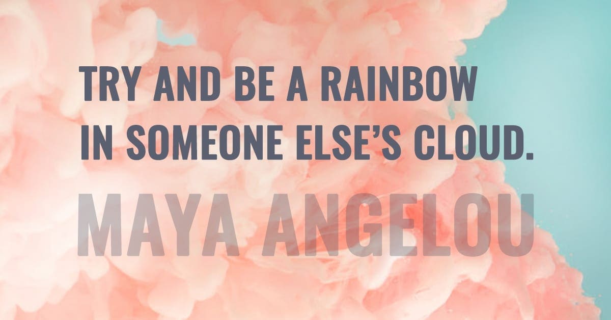
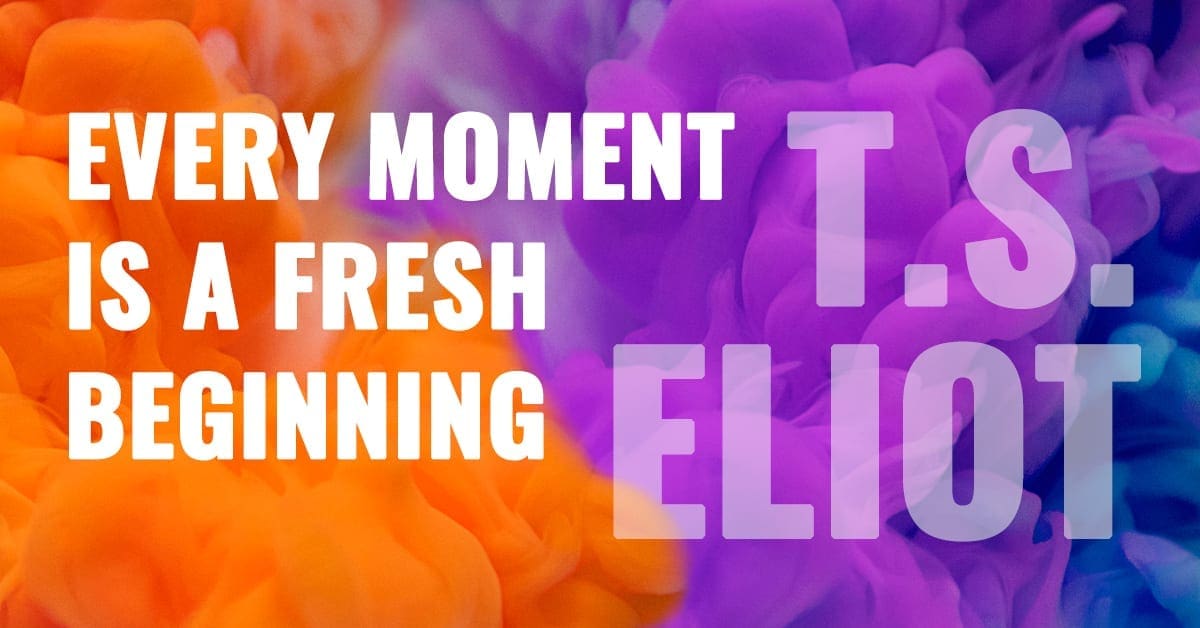
Samples below, and there are more in the image portal. 🙂
Image & Newsletter Sign-Up
Access our free image portal by signing up for free design and marketing tips! If you decide our suggestions are not for you, unsubscribe with no hard feelings, and you can still use the images. Give it a try; we think you'll be pleasantly surprised! 🙂
Get in Touch
The incredible thing about the internet is that we can work anywhere!
Woodchuck Arts is geo-located in Newark, Ohio, but we serve clients all over the United States.
info@woodchuckarts.com
724-910-1871


