What do you Need to Brand your Business
Let’s Talk Branding
Recognizability is what gives a company a definitive “brand”. Building this recognition takes not only providing a unique product or service, but also an effort to keep how your business presents themself consistent. This consistency means sticking strictly to a set of design choices associated with your company, like font choice, color palette, or specific shapes you associate with your brand.
Making all of these choices can be hard, which is why some businesses prefer to hire a designer to make a Brand Kit.
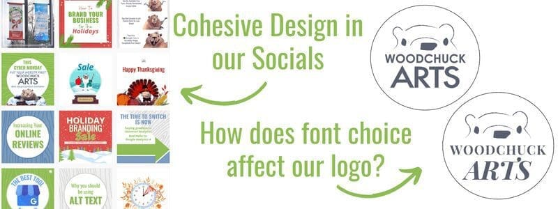
What is a brand kit?
A Brand Kit is a collection of design rules to follow when making materials related to your business. This usually includes everything from different logo variations, to color palettes.
We sometimes find that businesses come to us looking for design services only bringing a logo that they have, and aren’t completely set on specific font choices or colors beyond taking inspiration from their logo. While we do a stellar job matching new fonts and color choices to a logo, if you want cohesive & recognizable design, making a brand kit to give to your present and future designers is a great place to start!
So let’s go over some examples of what you can start to work on for your company’s brand kit, using our own here at Woodchuck Arts!
Color Palette
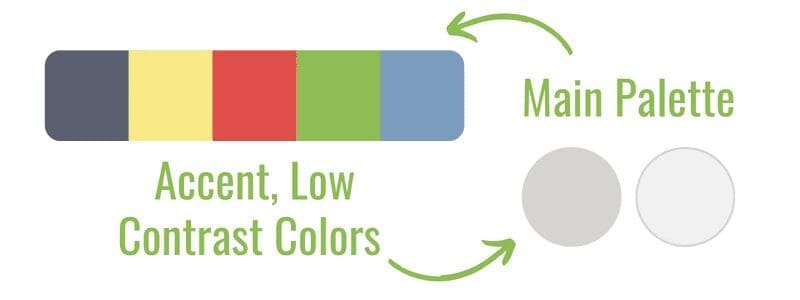
Your color palette sets the tone of your brand.
Before customers learn about your company, they might just spot an ad or product out of the corner of their eye, so it’s important to make sure your palette is strong!
Colors can have different connotations, like orange for energy and happiness, or purple for creativity and royalty.
If you don’t already have a palette picked out, take a bit of time to read up on color theory, and pick 1-5 colors that you want to try using for your brand!
You can use one of our favorite resources, Coolors.co, to test out how different colors work with each other, or explore pre-made palettes!
logo
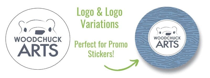
Taking both font and color in consideration, you can draft up a logo! While your business likely already has a logo, it can be a great time to re-examine if you like the fonts and colors on it, and if they represent what your company is all about.
Otherwise, make sure to have different variations of your logo on hand, like for example a one-color version to put on prints.
Font choice
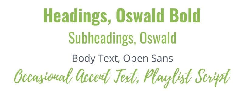
Fonts help define the tone of your brand.
When picking out fonts, you can choose from different categories like Serif, Sans Serif, or a Handwritten style font.
Generally serif and sans-serif are your best bet for any kind of informational text, as they are easier to read.
You’ll need to pick out at least three options, for your Header text, Sub-header text, and your Body text!
Headings and Sub-headings can use more decorative, less easily read fonts, because they are physically larger on the screen or print, so they are already easy to read.
One place we love to find fonts is Google Fonts, which provides an extensive library of free fonts to use!
Another amazing resource however is Fontjoy, a place that generates different font pairings that you can preview together. Set parameters for the fonts you want, lock in some decisions while randomizing others, and get font pairings you’re proud of!
Pattern
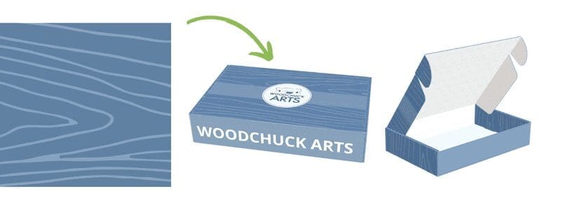
To round out your branding, it’s never a bad idea to have a consistent pattern your designers can put in empty space for accenting. For example, a pattern can be used to create areas of interest on your website, or make your product packaging stand out!
There are many types of patterns your business could decide to go with, some ideas could be repeated variations of your logo, blocks of text, artistic illustrations, or natural elements like the wood grain pattern we use here at Woodchuck!
Take a look at how we could use our wood grain pattern on the mock packaging.
Shape language likewise is the kinds of shapes you use on your branding.
At Woodchuck you may notice that our branding has a mix of rounded shapes and hard edges. In addition to our wood pattern, we use a lot of circles, and hard edged serif fonts.
This all goes together to give our branding a specific feeling! Take a look at other brands in your field, and see what kind of shapes they use in their marketing.
While it’s normal to mix and match different styles, generally noticeable brands have a few predominant shapes they continuously use!
Overall…
By having a brand kit, you can keep all of the material you put out consistent even if you work with different designers. You can also make it much easier to put together quality ads, websites, and packaging!
Whatever your business is trying to do, sell products, provide services, or otherwise- your brand standards are what people see first in regards to your company.
So it’s time to make sure you’re excited and confident about your design choices!
Free Social Media Images
Get access to our social media freebie portal! We have sized images for Instagram, Facebook, LinkedIn, & Twitter. You can brand any of these images for your business or use them for your personal social media platforms. This portal will always be available, and we will continually add fresh new content.
Samples below, and there are more in the image portal. 🙂
Image & Newsletter Sign-Up
Access our free image portal by signing up for free design and marketing tips! If you decide our suggestions are not for you, unsubscribe with no hard feelings, and you can still use the images. Give it a try; we think you'll be pleasantly surprised! 🙂
Get in Touch
The incredible thing about the internet is that we can work anywhere!
Woodchuck Arts is geo-located in Newark, Ohio, but we serve clients all over the United States.
info@woodchuckarts.com
724-910-1871
