How to Create Contrast
Your #1 Design Tool
In order to get dynamic & eye-catching designs, wether for web design, logo design, or print layouts, contrast and contrasting colors is your best friend! Having sections defined by contrast helps the reader take in all the information on your design. But how do you know when contrast becomes overwhelming? Are there rules you should be sticking to when creating contrast?
We’re going to go over some different elements you can change to create contrast in your work- and some tips on how to do it the right way!
Color
Color is the most common use of contrast!
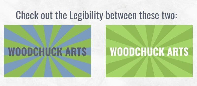
When contrasting colors for text & background, be sure to pick colors that have enough of a difference to keep text legibility.
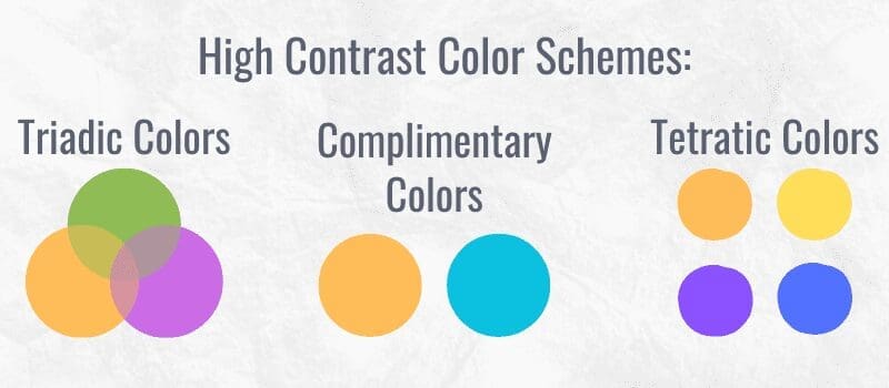
We’ve already gone over colors & psychological connotations before; but try out some of these color relationships when picking your next contrasting palette! Color relationships are a great way to quickly produce a new palette when you only have one or two colors in mind.
Pattern
Patterns are a great way to differentiate between spaces in your designs. You could put them to frame text, or to create interest in empty space.
Just like clothing, be careful about using two patterns next to one another, and how much you use a pattern. It is very easy to crowd the eye with too much noise when it comes to patterns.
Generally patterns are used in accent areas, because you don’t want text overlaid on top of an already loud pattern.
If your heart is set on it though- try creating more contrast between the pattern and text!
Shape
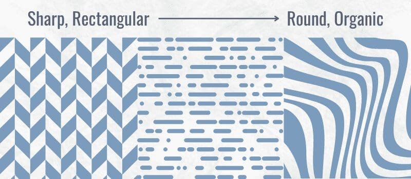
Varying the kinds of shapes you use in your design, and placing them in specific areas, is essential to denoting different spaces in your design. You can easily see how shapes differentiate spaces by checking out almost any web space, or looking at print brochures and menus!
Generally it’s good to keep the kinds of shapes you use consistent, like using sharp squares & rectangles vs round circles & organic shapes.
Size
We have already gone over how size can affect contrast, especially when talking about font. We’re not only talking about the size or thickness of a font though, you’ll want to keep in mind how much size every aspect takes up in your work. The area the text takes up, the space in between text blocks, and the blank space left around it all.
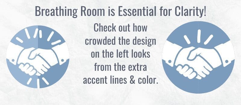
Varying the sizes of your elements can make a big difference in your design; especially when looking at the “breathing room” (blank space) surrounding it.
Overall…
We use contrast and contrasting colors constantly to naturally separate different ideas from each other; take a look back at these sections even! See how we use contrast to denote a title, main text, and example area?
Try mixing & matching a few of these aspects in your next work when building up contrast!
Free Social Media Images
Get access to our social media freebie portal! We have sized images for Instagram, Facebook, LinkedIn, & Twitter. You can brand any of these images for your business or use them for your personal social media platforms. This portal will always be available, and we will continually add fresh new content.
Samples below, and there are more in the image portal. 🙂
Image & Newsletter Sign-Up
Access our free image portal by signing up for free design and marketing tips! If you decide our suggestions are not for you, unsubscribe with no hard feelings, and you can still use the images. Give it a try; we think you'll be pleasantly surprised! 🙂
Get in Touch
The incredible thing about the internet is that we can work anywhere!
Woodchuck Arts is geo-located in Newark, Ohio, but we serve clients all over the United States.
info@woodchuckarts.com
724-910-1871
