An Introduction to Fonts
A Starting Guide
We have already gone over how essential your font choice is to defining your brand.
Now let’s learn some basic terminology to help talk about fonts, so you can feel confident talking with your designers about your needs!
We’ll be introducing you to the main 3 font families, which all fonts can more or less be put into. Then we’ll give the general mental connotations each family has, so you can decide which styles might match your brand identity!
Serif
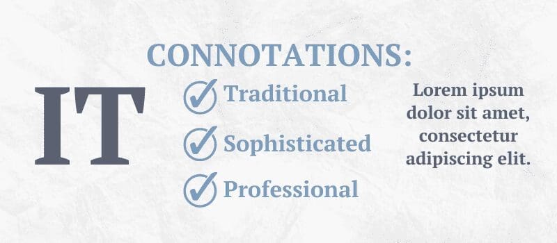
Serif-style fonts are characterized by the slight accents (serifs) on the edges of each letter. These fonts are great for any use, especially with the variety of different serif options available. Serif fonts are also generally very easy to read, which makes them perfect for large areas of text!
One of the biggest reasons to use Serif vs Sans-Serif is the connotations; Serif fonts are seen as traditional & professional. Newspapers, academic writing, & official documents use this style of font. Consider the feelings you want to convey with your marketing material when deciding your main font choices.
Sans Serif
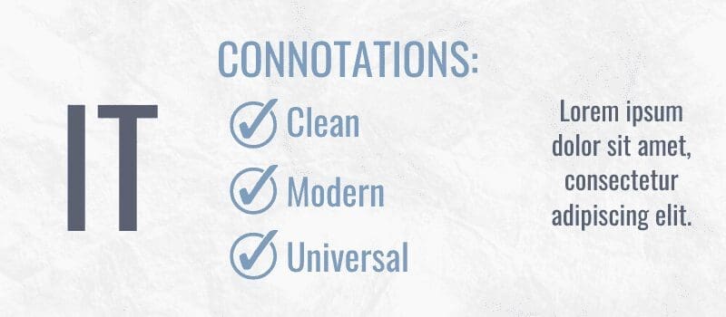
Sans-Serif fonts do not have serifs on them, giving them a cleaner and less formal look. These fonts likewise are great for any purpose, and have many options available. Sans-serif fonts are even easier to read than serif fonts though, which make them the #1 option for informational text.
Sans-serif fonts were invented in the early 19th century, but only really gained popularity as we moved into the 1900’s. Because of their relatively recent history, sans-serif fonts tend to be connotated with modernity & universality.
You’ll likely see many “futuristic” fonts fall into the sans serif family.
Script
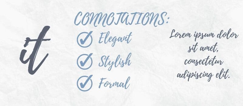
Script fonts are the most overall decorative family, mimicking the swooping motions of handwritten letters.
They are generally very elegant & decorative, you’ve likely seen them on luxury products, or wedding invitations.
Unfortunately script can often be harder to read because of the natural flourishes & details, which makes them better for title text, or logo text.
Font Weight
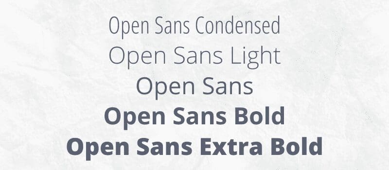
Font weight is the thickness of the lines of a font.
While bolding a font can be used to easily thicken it, there are usually different versions of a font that have different weights.
You might use different weights for a variety of reasons, usually to make contrast between areas of text, same as italicization.
Here are different versions with this font, Open Sans:
Leading & Kerning
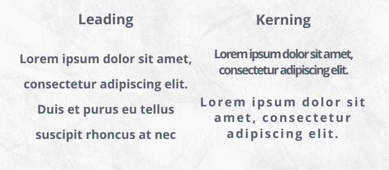
Leading is the sizing between lines of text, usually between 1x or 2x the size of the letters.
Giving a text block larger leading provides the font room to breathe, reducing surrounding noise and making it much easier to read.
Kerning is the space between each letter, generally only changed for accent text.
It’s important to be careful when changing the kerning of a font, because you’ll often find it hard to make the font look as good as with its default kerning. With that in mind, think about changing kerning for more design heavy uses, such as logos.
Font Pairing
When font pairing, you want to stick to a few general rules.
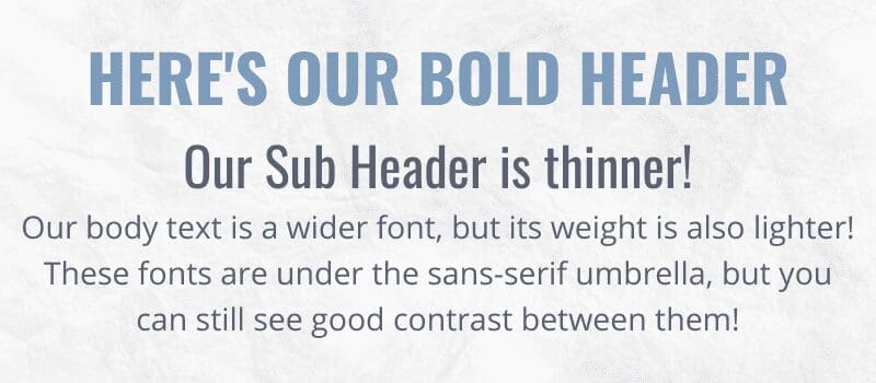
Contrast Style: Try pairing Serif with Sans-Serif fonts, and stay away from using fonts that look too similar in their weighting. This will make sure that your different areas of text don’t all blend into one big block.
Contrast Size: Your Header, Sub Header, and Body text should be different sizes, because they are meant to be boarders between different text areas.
Contrast Weight: Keep in mind the weight/boldness of a font, and it’s leading/kerning.
Overall…
There are many different fonts out there to check out- so take your time looking around the many extensive free font libraries, like our favorite: Google Fonts!
From unique decorative script fonts to plain body text serifs, understanding basic font terminology will help you make better design choices for your brand.
Free Social Media Images
Get access to our social media freebie portal! We have sized images for Instagram, Facebook, LinkedIn, & Twitter. You can brand any of these images for your business or use them for your personal social media platforms. This portal will always be available, and we will continually add fresh new content.
Samples below, and there are more in the image portal. 🙂
Image & Newsletter Sign-Up
Access our free image portal by signing up for free design and marketing tips! If you decide our suggestions are not for you, unsubscribe with no hard feelings, and you can still use the images. Give it a try; we think you'll be pleasantly surprised! 🙂
Get in Touch
The incredible thing about the internet is that we can work anywhere!
Woodchuck Arts is geo-located in Newark, Ohio, but we serve clients all over the United States.
info@woodchuckarts.com
724-910-1871
